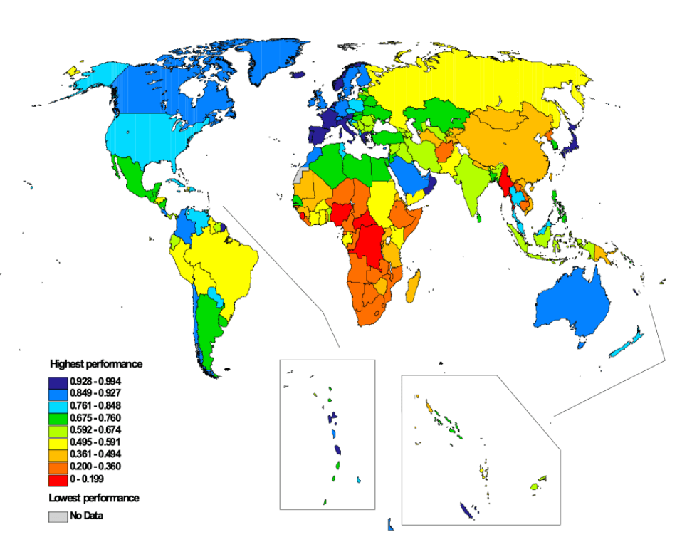
This world map depicts the countries that have the best- and worst-performing healthcare systems, as ranked by the World Health Organization.
The countries deemed as having the best healthcare sector are shaded in dark blue. These include a number of countries in Europe, some island nations off the Atlantic and Pacific oceans, as well as French Guiana (South America), Oman (Asia), and Japan (Asia).
Conversely, those marked in red have the least-performing healthcare systems, including some African countries and Myanmar (Burma) in Asia.
Help us out by sharing this map:
Can you be more specific about the content of your article? After reading it, I still have some doubts. Hope you can help me.
Thank you for your sharing. I am worried that I lack creative ideas. It is your article that makes me full of hope. Thank you. But, I have a question, can you help me? https://www.binance.com/ka-GE/register?ref=ILE8IH9H
Your point of view caught my eye and was very interesting. Thanks. I have a question for you. https://accounts.binance.com/sl/register?ref=I3OM7SCZ
Thanks for sharing. I read many of your blog posts, cool, your blog is very good. https://www.binance.info/bg/register?ref=V2H9AFPY
Can you be more specific about the content of your article? After reading it, I still have some doubts. Hope you can help me.
Your article helped me a lot, is there any more related content? Thanks!
I don’t think the title of your article matches the content lol. Just kidding, mainly because I had some doubts after reading the article.
Thanks for sharing. I read many of your blog posts, cool, your blog is very good. https://www.binance.bh/register?ref=JW3W4Y3A