Map found on Reddit
If you have ever wondered why your neighbors in rural Minnesota have a different last name style than folks in coastal Massachusetts, this map (with data from the 2020 US Census) is going to make a lot of things click into place.
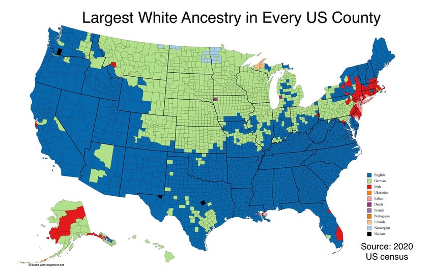
The map shows the single largest white ancestry group in every US county, and the patterns are striking.
The Blue Wave: English Roots Run Deep
The first thing you notice is just how much blue there is. Blue represents English ancestry, and it dominates the entire South, much of the West, and large stretches of New England and Appalachia.
This reflects the colonial footprint of early British settlement, which pushed westward and southward over generations.
The Green Belt: Germany’s Quiet Conquest of the Midwest
That wide band of green sweeping through the Midwest from Texas up through the Dakotas represents German ancestry, and it is genuinely impressive in scale. Germans arrived in enormous numbers throughout the 1800s, drawn by affordable farmland and relatively open immigration policies.
States like Wisconsin, Minnesota, Nebraska, and the Dakotas became deeply German in character, a legacy still visible in local surnames, town names, and yes, beer culture.
The Red Pockets: Irish America
Scattered red counties appear in parts of New England, the mid-Atlantic, and interestingly, in southern Alaska.
These represent Irish ancestry as the dominant group, a reminder of the massive wave of Irish immigration that followed the Great Famine of the 1840s. Boston and its surroundings stand out particularly strongly.
The Surprises Worth Noticing
A few genuinely interesting outliers jump out:
Ukrainian ancestry shows up in orange in parts of North Dakota, reflecting deliberate settlement of Ukrainian farming communities on the Great Plains in the late 19th and early 20th centuries.
Finnish ancestry appears in parts of the upper Midwest, particularly Michigan and Minnesota, where Finnish immigrants settled heavily around the mining and logging industries.
Italian ancestry in purple dots the mid-Atlantic and Northeast, consistent with the great wave of Southern and Eastern European immigration between roughly 1880 and 1920.
What the Map Really Tells Us
More than anything, this map is a visual record of where ships landed, where railroads ran, and where land was cheap. Immigration was rarely random. People followed networks of family and community, which is why entire counties ended up dominated by a single ancestry group well over a century later.
The US likes to call itself a melting pot, and that is true in many urban areas. But out in the counties? The old world left fingerprints that have barely faded.
Worth bookmarking the next time someone tells you America has no history.
Help us out by sharing this map: