Paris’s 5,000 km Radius Circle Map: Why the World Looks Weird on Your Screen
Map by Reddit user dranerertiam Ever wonder why Greenland looks massive compared to Africa on Google Maps, even though Africa …
Read moreOver 2 decades of remodeling experience, Joe is an expert in home improvement. He is now the Managing Editor of PlumbJoe where he writes guides for homeowners. His hobbies include climbing, running and playing the piano.
Map by Reddit user dranerertiam Ever wonder why Greenland looks massive compared to Africa on Google Maps, even though Africa …
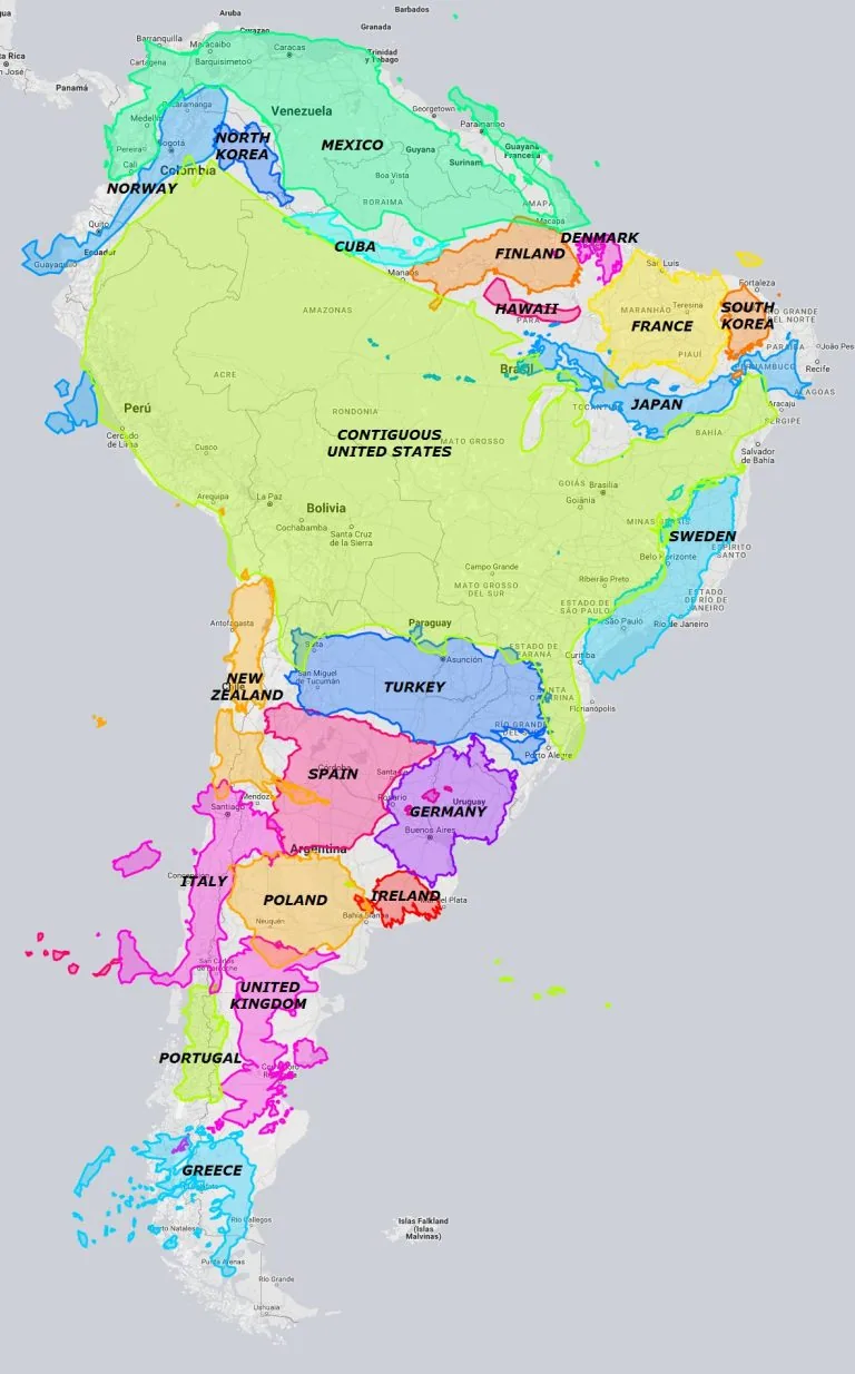
Read moreMap by Reddit user utioniaboi Remember staring at world maps in school and thinking South America looked pretty average-sized? Well, …
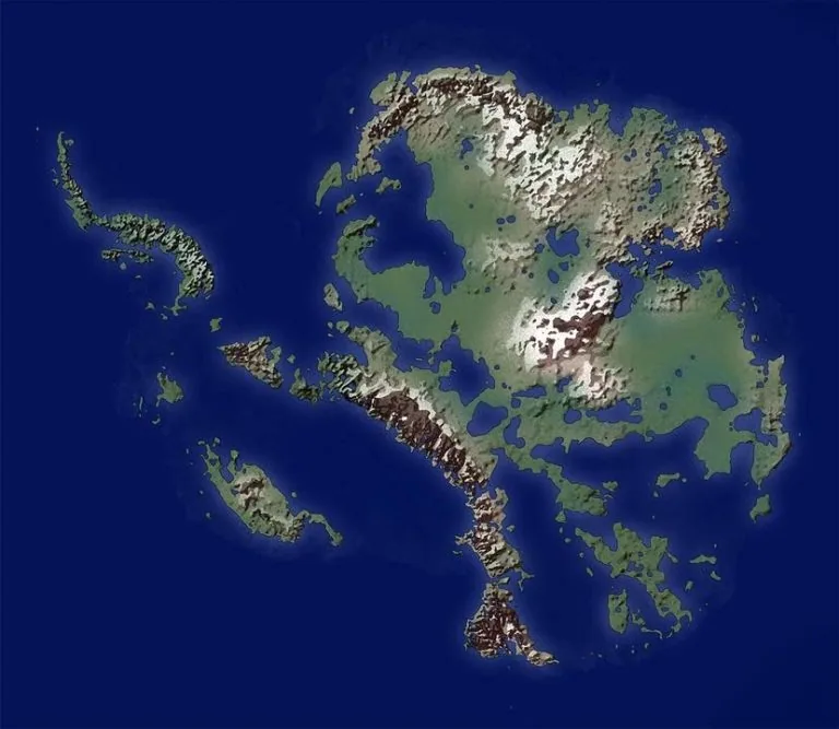
Read moreMap by Reddit user Geo-ICT Ever wondered what lies beneath Antarctica’s massive ice sheet? This fascinating map shows us exactly …
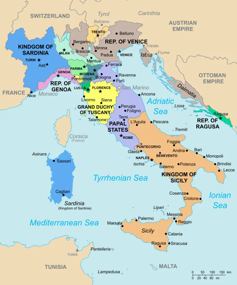
Read moreMap by Citypeek / Wikimedia Commons Looking at Italy in 1796 is like examining a complex jigsaw puzzle where each …
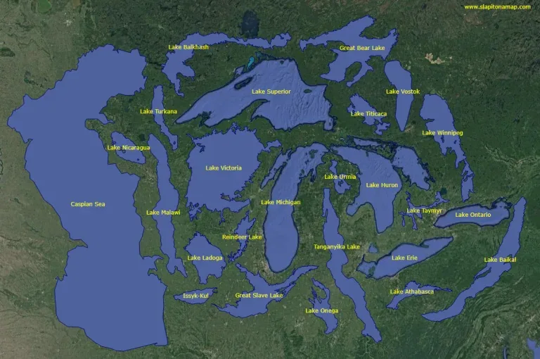
Read moreMap by Visual Capitalist Ever wondered how the Great Lakes would look if placed next to Lake Baikal? This fascinating …
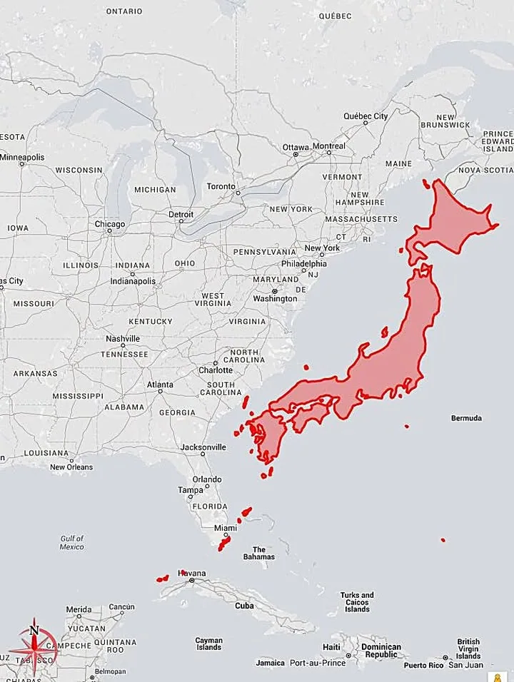
Read moreMap by Reddit user bill_hicks21 Most world maps lie to us about Japan’s actual size. Thanks to the Mercator projection …
Read more