Map found on Reddit
If you’ve ever visited a Nordic country in December and felt oddly unsettled by 4pm darkness, this map will explain exactly why.
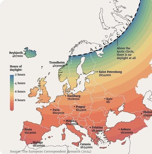
Research from The European Correspondent (2024) visualizes just how dramatically daylight hours vary across Europe during winter, and the differences are frankly staggering.
From Nearly Nothing to Nearly Normal
At the extreme end, Reykjavik in Iceland limps along on just 4 hours and 7 minutes of daylight. Trondheim in Norway fares only slightly better at 4 hours and 30 minutes. These aren’t cloudy days we’re talking about; this is the hard ceiling imposed by the Earth’s axial tilt.
Go further north, past the Arctic Circle, and there’s no daylight at all.
Saint Petersburg, despite being a major European city, manages only 5 hours and 54 minutes. Hamburg gets 7 hours 28 minutes, which sounds reasonable until you realise that most of those hours happen while you’re sitting at a desk.
The Southern Advantage
Head south and the picture brightens considerably. Malaga in Spain’s Costa del Sol tops the chart at 9 hours and 39 minutes, while Porto and Catania both sit comfortably above 9 hours. Even Ankara and Tbilisi, often overlooked in these conversations, enjoy over 9 hours of winter sun.
Paris sits in an interesting middle ground at 8 hours and 15 minutes, which partly explains the French cultural obsession with long, candlelit dinners. When the sun disappears early, you adapt.
Why Does This Actually Matter?
Beyond the obvious lifestyle differences, sustained low daylight has measurable effects on human health.
Vitamin D deficiency becomes a genuine concern above certain latitudes, and Seasonal Affective Disorder (SAD) is significantly more prevalent in northern European countries. Nordic nations have long built architecture, working cultures, and social habits around compensating for this light deficit.
The gradient on this map is also a quiet explanation for migration patterns, energy consumption differences, and even varying rates of cafe culture across the continent.
The Color Tells the Story
What makes this visualisation so effective is its color coding, transitioning from deep red in the sun-drenched south to pale yellow and eventually cool tones in the north. It maps almost perfectly onto cultural intuitions many Europeans already hold about northern reserve versus southern warmth. The sun, it turns out, might have more to do with that than we give it credit for.
Next time someone from Oslo seems stoic in January, remember they’ve been running on four and a half hours of daylight. You would be too.
Help us out by sharing this map: