Paris’s 5,000 km Radius Circle Map: Why the World Looks Weird on Your Screen
Map by Reddit user dranerertiam Ever wonder why Greenland looks massive compared to Africa on Google Maps, even though Africa …
Map by Reddit user dranerertiam Ever wonder why Greenland looks massive compared to Africa on Google Maps, even though Africa …
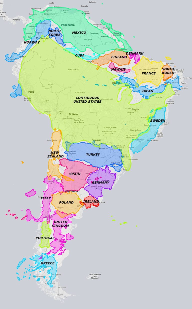
Map by Reddit user utioniaboi Remember staring at world maps in school and thinking South America looked pretty average-sized? Well, …

Map by Reddit user Geo-ICT Ever wondered what lies beneath Antarctica’s massive ice sheet? This fascinating map shows us exactly …
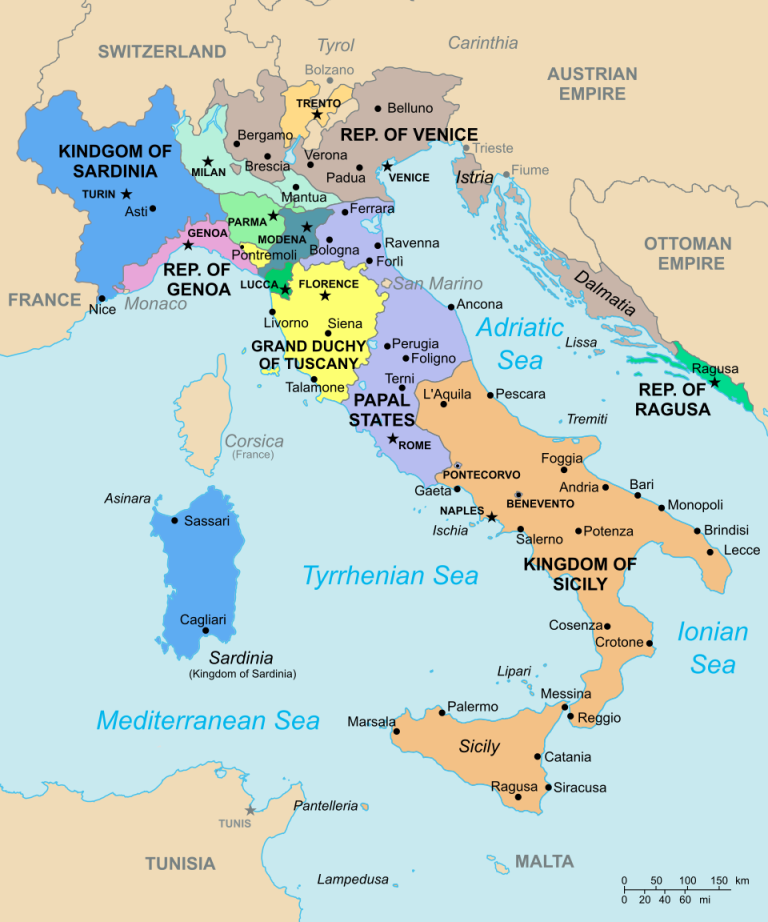
Map by Citypeek / Wikimedia Commons Looking at Italy in 1796 is like examining a complex jigsaw puzzle where each …

Map by Visual Capitalist Ever wondered how the Great Lakes would look if placed next to Lake Baikal? This fascinating …

Map by Reddit user bill_hicks21 Most world maps lie to us about Japan’s actual size. Thanks to the Mercator projection …