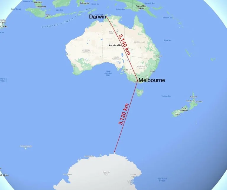
Melbourne Is Closer to Antarctica Than Darwin: The Geography That Will Blow Your Mind
Map by Reddit user Improv92 Looking at this map, your brain might need a moment to process what you’re seeing. …
Read moreMap by Reddit user Improv92 Looking at this map, your brain might need a moment to process what you’re seeing. …
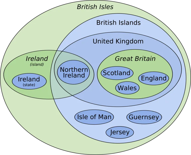
Read moreMap by TWCarlson / Wikimedia Commons The British Isles can be confusing territory, both literally and figuratively. This clever Euler …
Read moreMap by Reddit user OppositeRock4217 Looking at this striking map, we’re witnessing one of the most significant demographic trends of …
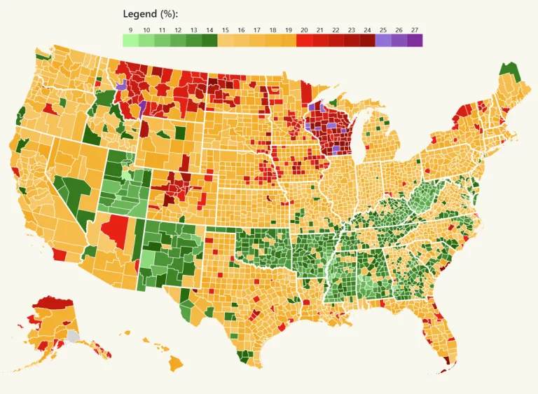
Read moreMap by Intoxistates Ever wondered how your county stacks up when it comes to excessive drinking? This fascinating map reveals …
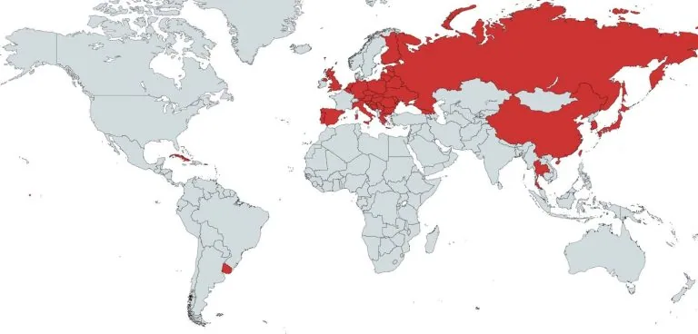
Read moreWar has a way of leaving its mark on history, and nowhere is this more evident than across the European …
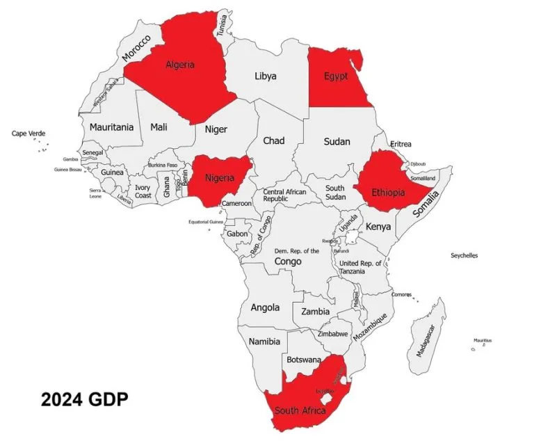
Read moreLooking at this map of Africa, those red countries aren’t just randomly colored. They represent something remarkable: just five nations …
Read more