Map by Branden Rishel / Cartographers Without Borders
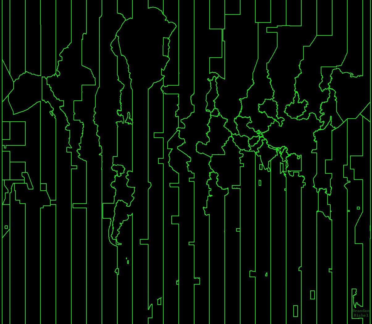
Look at this striking green-on-black visualization of our planet, and you’re seeing something most of us take for granted every day: the invisible lines that govern when we wake up, work, and connect with people across the globe.
This isn’t your typical world map. Instead, it’s a fascinating representation of Earth constructed entirely from time zone boundaries, creating an almost digital art piece that reveals the hidden geometry of global timekeeping.
Why Time Zones Look This Way
The jagged, geometric patterns you see aren’t random. They reflect the practical compromises governments make when deciding what time their citizens should follow.
While the sun doesn’t care about political borders, countries do. China famously uses just one time zone across its entire territory, creating that massive unbroken block you see stretching across Asia. Meanwhile, places like India use half-hour offsets, and some remote islands create tiny time zone fragments scattered across the oceans.
The Art of Practical Decisions
What makes this map so visually compelling is how it transforms mundane administrative choices into something that looks almost like circuit board patterns or abstract digital art.
Those sharp angles and unexpected curves? They represent real decisions made by real people trying to balance solar time with economic convenience, national unity with local preferences.
A Different Way to See Our World
Traditional maps show us mountains, rivers, and political boundaries. This time zone map reveals something else entirely: the human attempt to impose order on the chaos of a spinning planet.
The green lines trace not just geographic features, but the flow of business hours, the rhythm of international calls, and the coordination required for our interconnected world to function.
The Poetry of Punctuality
Every line on this map represents millions of people synchronizing their lives. When you schedule that important video call with colleagues in three different countries, you’re navigating this exact network. When your favorite streaming service releases a new episode “at midnight,” they’re working within these boundaries. The map shows us that time isn’t just a number on a clock but a shared social agreement that spans continents.
This visualization reminds us that even the most basic aspects of modern life require remarkable coordination. The next time you check what time it is somewhere else in the world, remember that you’re participating in one of humanity’s most successful global collaborations: our collective agreement on when now actually is.
Help us out by sharing this map: