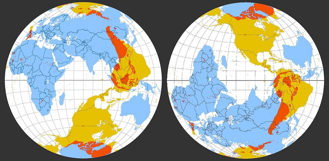
If you have ever looked at a world map and wondered which parts of our planet are covered in rolling plains versus thick forest versus sun-baked savanna, this striking dual-hemisphere visualization does a beautiful job of answering that question at a glance.
The three colors each tell a distinct story. Blue represents forested and temperate regions. Yellow marks tropical and subtropical savannas. Orange and red highlight the world’s temperate grasslands, steppes, and prairies, with the deepest red indicating the most intensely grass-dominated terrain.
The Great Plains Jump Off the Map
The most eye-catching feature on the left globe is that bold orange-red mass cutting through central North America. This is the Great Plains, one of the largest contiguous grassland systems on the planet, stretching from Canada down through the United States and into Mexico. It is a region that shaped human civilization, fuelled the cattle industry, and still feeds much of the world today.
Scroll your eye down, and you will notice a similar warm-colored patch in southeastern South America. That is the Pampas, the fertile grassland heartland of Argentina, Uruguay, and southern Brazil, an agricultural powerhouse every bit as significant as its northern counterpart.
Africa and the Savanna Belt
The broad yellow sweep across sub-Saharan Africa on the right globe represents the vast savanna belt, a mosaic of grassland and open woodland that supports the most spectacular wildlife on Earth.
This is the world of the Serengeti migration, the acacia tree silhouette, and dry-season dust clouds. It is not purely grass, but grass rules the landscape for much of the year.
Why the Blue Zones Matter Too
The blue areas covering much of Europe, northern Asia, and the Pacific Northwest are a reminder that forests still dominate large portions of the temperate world, even if they face ongoing pressure from agriculture and development.
These are the lungs of the northern hemisphere, and their contrast with the open grassland zones helps explain enormous differences in biodiversity, agriculture, and even cultural history between regions.
What This Map Is Really Saying
At its core, this visualization is a reminder that Earth is not one uniform place. The land surface is a patchwork of dramatically different ecosystems, each shaped by rainfall, temperature, and geology over millions of years. Understanding where grasslands sit versus forests versus savannas helps explain everything from where our food comes from to why certain civilizations rose where they did.
Next time someone tells you a field is just a field, show them this map. That field is part of something enormous.
Help us out by sharing this map: