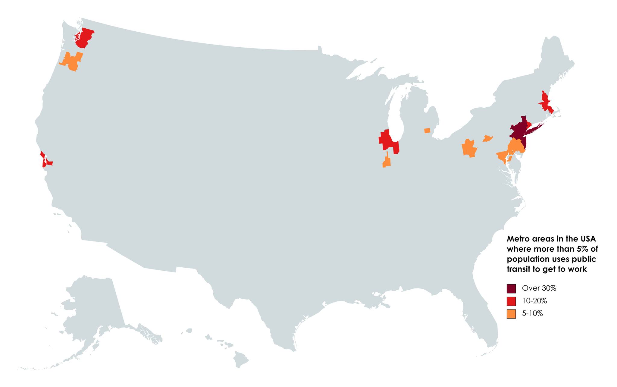
America is a nation of drivers, with only a few scattered pockets where people actually take public transit to work. The stark visual tells a story that many of us already know intuitively, but seeing it laid out geographically really drives the point home.
The Numbers Don’t Lie
Nationwide, only 3% of Americans use public transit to get to work, while a whopping 77% drive. But that tiny percentage isn’t spread evenly across the country. Instead, it’s concentrated in just a few major metropolitan areas that show up as colorful dots on an otherwise gray map.
The darkest areas on this map, representing over 30% public transit usage, are almost exclusively found in the Northeast. Roughly 3 million of the nation’s 7.8 million public transportation commuters live in the New York metro area alone. That’s nearly 40% of all transit commuters in the entire country living in just one metropolitan region.
Where Transit Actually Works
The red and orange patches you see scattered across the map represent some familiar names in American public transportation.
Only five other urban areas, including metropolitan Boston, Chicago, San Francisco, Philadelphia, and Washington (D.C.), have annual transit ridership levels exceeding 75 trips per capita. These six metros, plus New York, essentially carry the weight of American public transit usage.
Commuting by transit makes up a greater share of trips in larger metropolitan areas: 12.7% in areas with populations over 5 million, 5.9% in areas between 2.5 and 5 million, and 2.5% in areas between 1 and 2.5 million. Size matters when it comes to building transit systems that people actually use.
The Great American Transit Divide
What’s striking about this map isn’t just where people use transit, but where they don’t. Vast swaths of the American heartland remain completely gray, indicating that fewer than 5% of workers in those areas rely on public transportation.
This isn’t necessarily a failure of policy, it’s often a reflection of geography, population density, and urban planning that prioritized cars from the beginning.
The scattered orange dots in places like Seattle, Portland, Denver, and a few other western cities show that it’s possible to build transit ridership outside the traditional Northeast corridor, but it requires significant investment and the right urban conditions.
Looking Forward
In the largest cities of U.S. metro areas, 11.5% of workers commuted by transit, showing that when transit infrastructure exists and cities are built to support it, Americans will use it.
The challenge for the rest of the country is whether investing in public transit makes sense given existing development patterns, or if other solutions like remote work and electric vehicles might be more practical paths forward.
This map serves as a reminder that American transportation habits aren’t uniform.
While most of the country drives to work, those colorful patches represent millions of Americans who’ve embraced a different way of getting around, proving that public transit can work in America when the conditions are right.
Help us out by sharing this map: