If you’ve ever wondered whether where you live in France affects how long you live, the answer is a resounding yes.
Two striking maps showing 2022 life expectancy data broken down by department reveal a country with some fascinating and occasionally sobering regional divides.
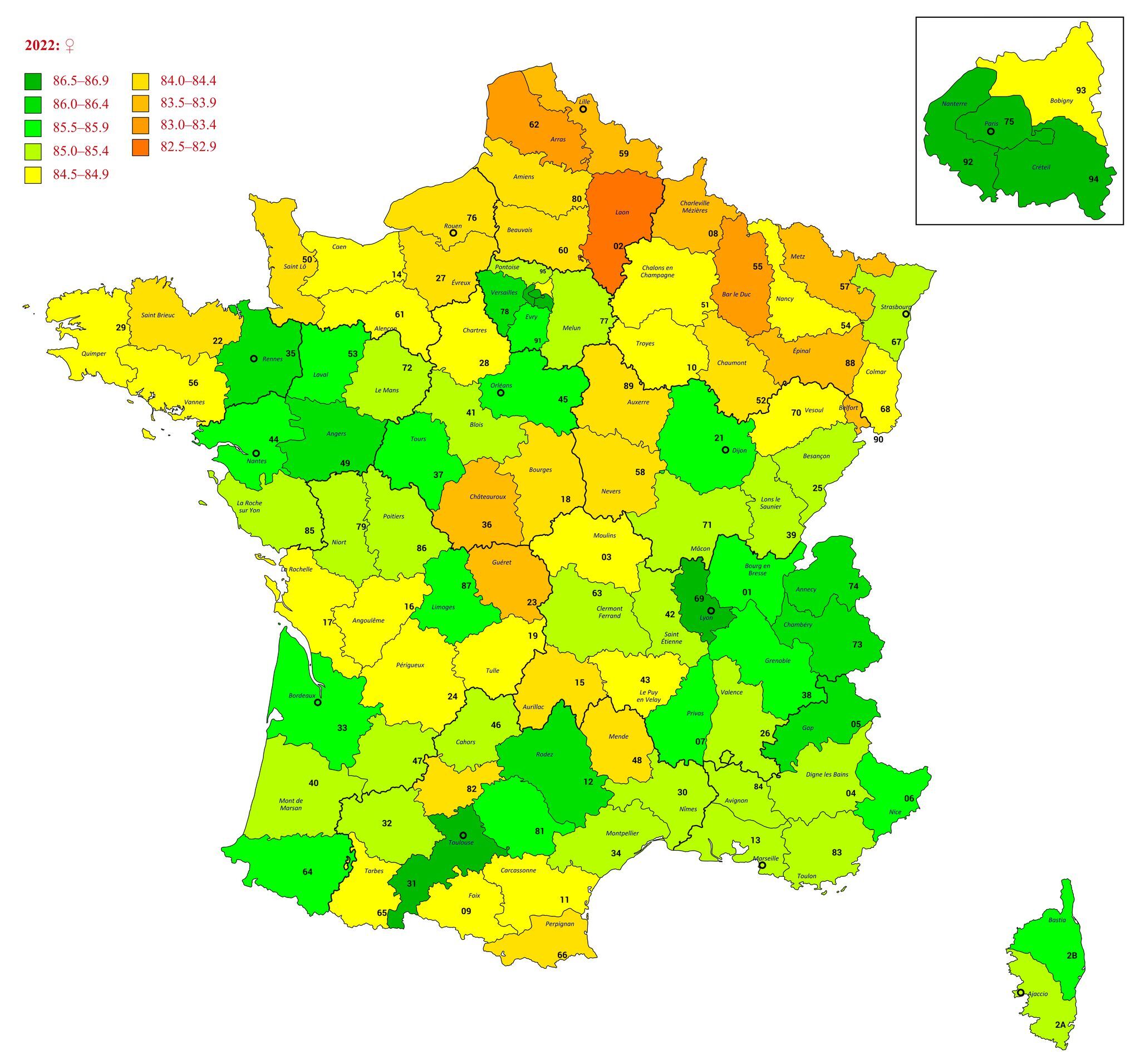
The Gender Gap Is Real and Significant
The first thing that jumps out is the difference in scale between men and women. French men in the best-performing departments are living into their early 80s, while French women in the top areas are reaching their mid to late 80s.
That is a gap of roughly five to six years, which is consistent with what researchers see across most developed nations. Women simply, on average, outlive men.
The North Struggles, The South and West Thrive
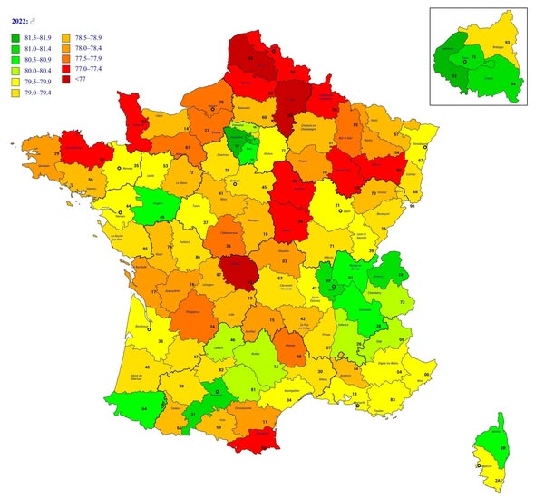
For men, the map tells a vivid story in colour. The northern departments, particularly around Nord (59), Pas de Calais (62), and parts of the northeast, are painted in deep reds and oranges, signalling life expectancy figures dipping below 77 years. That is notably low by French standards.
Meanwhile, the Atlantic southwest, parts of Brittany, and the Île de France suburbs show greens and yellows, indicating men living well into their early 80s. The Paris metropolitan area and its surrounding departments perform surprisingly well for men.
For women, the story shifts slightly. The north still underperforms, with department 02 (Aisne) standing out in dark orange as one of the lowest female life expectancy zones in the country. However, the green spreads generously across the south, southwest, Brittany, and particularly the Lyon region and its Alpine neighbours.
Why Do These Gaps Exist?
Regional health disparities in France are driven by a combination of factors that researchers have studied for decades.
Industrial history plays a major role: the north was home to heavy mining and manufacturing, leaving lasting health legacies in local populations. Lifestyle factors, diet, access to healthcare, income levels, and rates of smoking and alcohol consumption all contribute meaningfully to these differences.
The southwest of France, sometimes called the French part of the broader “Mediterranean diet zone,” benefits from dietary habits and a pace of life that appears to support longevity.
What the Maps Don’t Tell You
Numbers on a map are averages, and averages hide individual stories. A person in a red department is not destined for an early death, just as living in a green one is no guarantee of a long life. But at a population level, these patterns matter enormously for healthcare planning, pension policy, and regional investment.
France as a whole remains one of the longer-lived nations on earth. These maps simply remind us that geography, history, and social conditions shape health in ways that go far beyond personal choices.
Help us out by sharing this map: