The Sky’s the Limit: Exploring the World’s Longest Non-Stop Passenger Flights
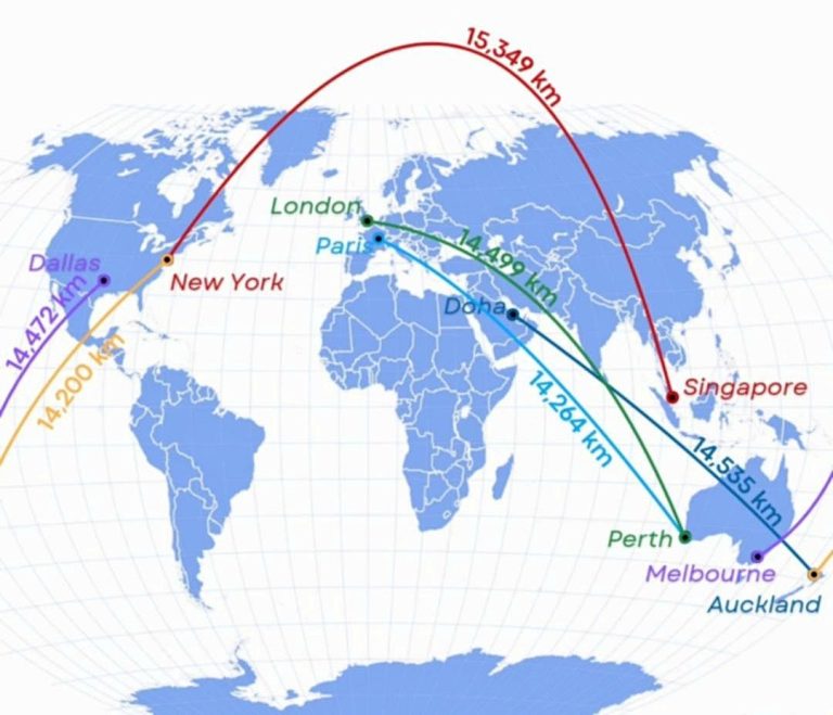
Map by Reddit user wassim_wsm Looking at this fascinating flight map, we can see how aviation has pushed the boundaries …
Map by Reddit user wassim_wsm Looking at this fascinating flight map, we can see how aviation has pushed the boundaries …

Map by Reddit user Loud_Guardian Ever wondered what lies beneath the waves surrounding Europe? This remarkable map shows us exactly …
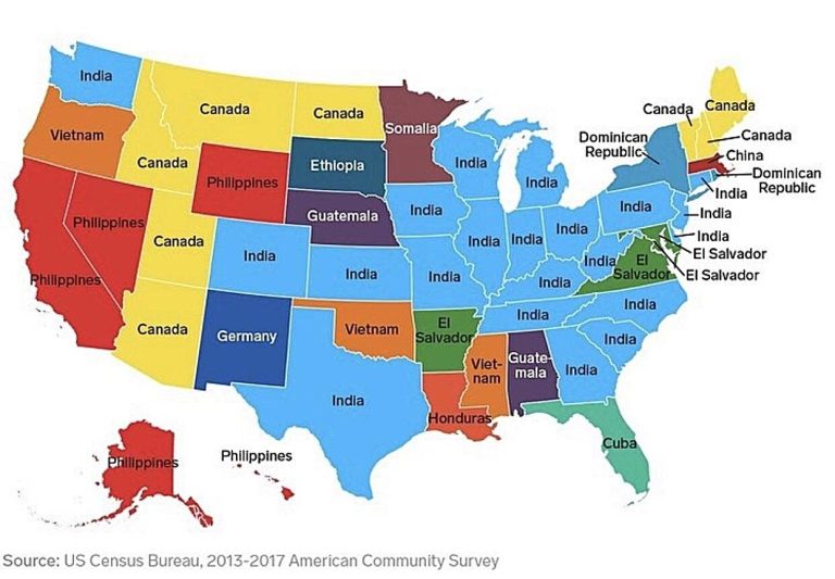
Map by Reddit user vladgrinch Take a look at this fascinating map showing the most common birthplace of immigrants (excluding …
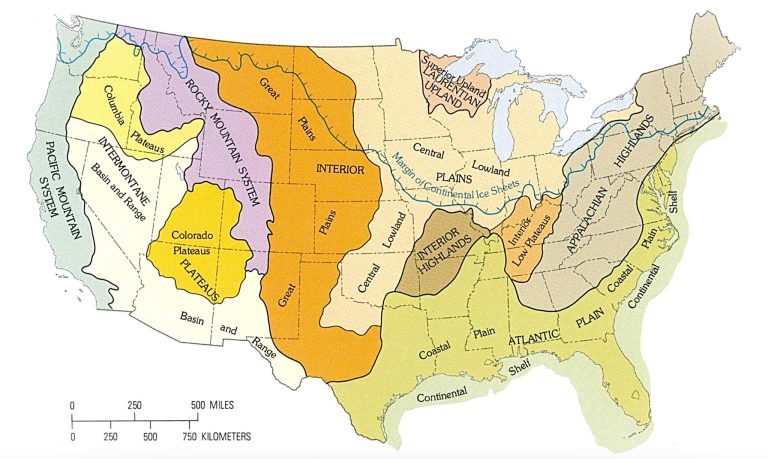
Map by the U.S. Geological Survey Ever wonder why Kansas feels so different from Colorado, or why the Appalachians have …
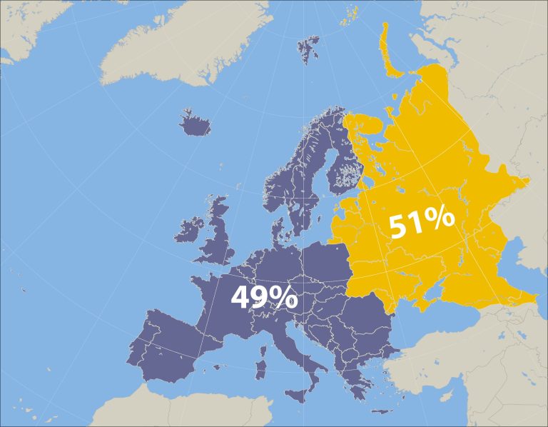
Map by Reddit user denn23rus When you think of Europe, what comes to mind? Perhaps the romantic canals of Venice, …
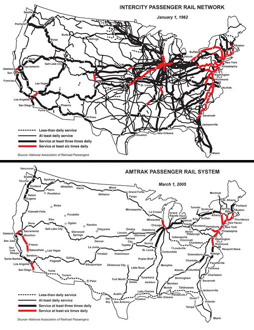
Map by Malcom Kenton / National Association of Railroad Passengers Remember when you could hop on a train from almost …