Map by Athelstan Spilhaus; recreated by Clara Dealberto
Most of us grew up learning about five separate oceans: the Atlantic, Pacific, Indian, Arctic, and Southern. We memorized their names, their approximate sizes, and their locations on a standard world map. But what if that traditional view has been misleading us all along?
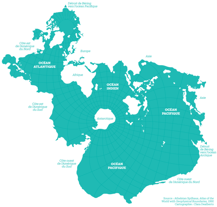
In 1942, a South African oceanographer named Athelstan Spilhaus created something remarkable. Instead of breaking up the world’s waters into convenient chunks separated by land masses, he reimagined the entire projection. His revolutionary map shows Earth’s oceans as what they truly are: one continuous, interconnected body of water.
The Traditional Problem
Standard world maps like the Mercator projection prioritize land masses. They place continents front and center, relegating oceans to the background or splitting them awkwardly at the edges. This makes perfect sense if you’re planning overland trade routes or studying political boundaries. But it completely misrepresents the marine reality of our planet.
Earth is a water world. Over 70% of our surface is ocean, and every drop of that water connects to every other drop. A message in a bottle thrown into the Pacific could theoretically wash up on the shores of the Indian Ocean. Marine life, ocean currents, and water temperatures all flow as part of one massive system.
The Spilhaus Solution
The Spilhaus projection flips the script entirely. By strategically placing the continents around the edges, the map reveals the ocean in all its unified glory. Antarctica sits at the center like a frozen island in a vast blue expanse. The Atlantic, Pacific, and Indian Oceans flow seamlessly into one another, just as they do in reality.
This perspective isn’t just aesthetically interesting. It has profound implications for how we understand climate, marine biology, and oceanography. Weather patterns make more sense when you see how air masses move across connected water surfaces. Ocean currents that seem random on traditional maps reveal themselves as parts of global circulation systems.
Why It Matters Today
In our era of climate change and marine conservation, the Spilhaus projection feels more relevant than ever. Rising sea levels, ocean acidification, plastic pollution, and dying coral reefs aren’t isolated regional problems. They’re all connected because the ocean itself is connected.
When you see the world through Spilhaus’s eyes, you understand viscerally that dumping waste in one part of the ocean affects the entire system. You grasp why whale migrations span such vast distances. You recognize that maritime weather events thousands of miles away can influence local conditions.
The genius of this 1942 map lies in its simplicity. By changing perspective, Spilhaus didn’t just create a new way of drawing the world. He created a new way of thinking about it. And that shift in perspective might be exactly what we need as we navigate the environmental challenges ahead.
Help us out by sharing this map: