Map by Reddit user sverdrupian
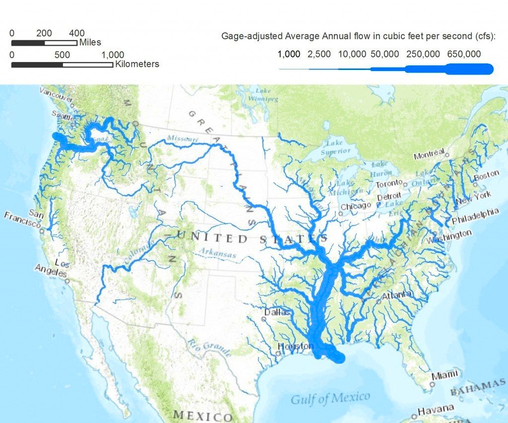
Looking at this fascinating flow-rate map of America’s rivers, the Mississippi’s dominance is impossible to ignore.
That thick blue artery snaking down the continent’s midsection carries an absolutely staggering amount of water: over 650,000 cubic feet per second on average.
To put that in perspective, that’s enough water to fill an Olympic swimming pool every two seconds. No wonder early settlers called it the “Father of Waters.”
The West’s Water Reality Check
Here’s where things get interesting for those of us used to seeing traditional maps.
Out west, those rivers that look so impressive on regular maps – the Colorado, the Rio Grande – barely register as thin blue lines here.
The Colorado River, which carved the Grand Canyon and supports 40 million people, carries less water than many streams you’ve never heard of back east. It’s a sobering reminder of why water rights are such serious business in the American West.
Northern Powerhouses You Probably Overlooked
While everyone talks about the Mississippi, take a closer look at the northern border regions.
The Columbia River system in the Pacific Northwest and the Great Lakes drainage systems are absolute water-moving monsters. The Columbia, fed by snowmelt from the Cascades and Rockies, carries more water than most entire river systems in other countries.
Meanwhile, those rivers connecting the Great Lakes move volumes that would make many famous world rivers jealous.
Why Size Doesn’t Always Matter
Traditional maps show river length and width, but this flow-rate visualization tells the real story of America’s water infrastructure.
A river might stretch for hundreds of miles but only carry a trickle compared to a shorter waterway fed by heavy rainfall or snowmelt. It’s like comparing highways by their length versus their actual traffic volume; completely different stories.
The Climate Story Hidden in Blue
This map is essentially a climate map in disguise.
Those thick blue lines in the Southeast? That’s where America gets serious rainfall. The thin lines in the Southwest? That’s our desert reality. The seasonal variations these rivers experience, from spring snowmelt floods to summer low flows, tell the story of our continent’s weather patterns better than any temperature chart.
Understanding these flow patterns matters more than you might think. These aren’t just pretty blue lines—they’re the arteries that move our drinking water, power our cities, irrigate our crops, and transport our goods. Next time you see a river, remember: it’s not just how big it looks, but how much water it actually moves that tells the real story.
Help us out by sharing this map: