Map from Wikimedia Commons
South Africa is one of the most geographically and demographically fascinating countries on earth, and this map from the 2011 Census makes that crystal clear.
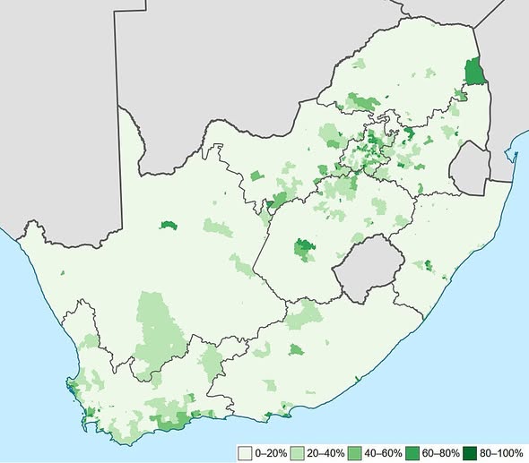
Each shade of green represents the proportion of white South Africans living in a given area, ranging from near zero (pale white) all the way up to 80 100% (deep green). What emerges is a portrait of a nation where history, economics, and geography are all deeply intertwined.
The Gauteng Cluster: South Africa’s White Heartland
The most immediately striking feature is the dense concentration of darker greens in and around Gauteng, the country’s economic engine.
Johannesburg, Pretoria, and their surrounding suburbs show up as a rich patchwork of mid to deep greens, reflecting the long-established white suburban belt that grew up around mining wealth and commercial infrastructure over the past century. This is where opportunity concentrated, and where much of the white population followed.
The Western Cape: A Second Hub in the Southwest
Down in the southwestern corner, the Cape Winelands and Cape Peninsula show notable concentrations too, particularly around the Stellenbosch and Franschhoek corridors.
Cape Town has long been a draw for white South Africans and, increasingly, for internal migration from other provinces. The lifestyle, scenery, and economic base of the Western Cape make it one of the few regions outside Gauteng with consistently elevated proportions.
The Vast, Empty Interior
What is equally telling is how much of the map stays pale. The Northern Cape, covering a huge swathe of the country’s interior, is overwhelmingly light.
This is some of the most sparsely populated land in southern Africa, dominated by the Karoo and Kalahari landscapes. Where people are sparse overall, the map naturally reflects that thinness across all demographic groups.
Small Towns with Big Proportions
Scattered across the Eastern Cape and KwaZulu-Natal, you can spot isolated pockets of deeper green. These often correspond to small farming towns or coastal retirement communities where, historically, white South Africans settled in significant numbers relative to the local population.
The proportions look high, but the absolute numbers can be quite small.
What the Map Does Not Show
It is worth remembering that this map shows proportion, not total population. A tiny deep green dot in a rural area might represent just a few hundred people. The real story of where South Africans of all backgrounds live is a layered one, shaped by apartheid era spatial planning, post-1994 urbanisation, and ongoing economic migration toward cities.
Maps like this one are a reminder that understanding a country properly means reading between the shades.
Help us out by sharing this map: