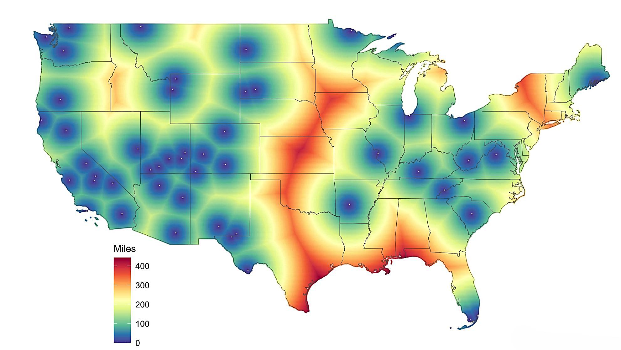
For thousands of Americans, visiting a national park means loading up the minivan for a multi-day road trip across state lines. For others, it’s a simple weekend afternoon drive. A look at the map above reveals that proximity to our natural wonders is far from evenly distributed across the country.
The Geography of Inequality
Looking at this distance map, several patterns jump out immediately. The American West, as well as great stretches of the East, painted in cooler blues and greens, enjoys relatively close proximity to national parks, with most residents living within 200 miles of protected lands.
Meanwhile, vast swaths of the Great Plains stretch out in warm oranges and reds, indicating distances of 300-400 miles to the nearest national park.
The National Park Service reported a record 331.9 million recreation visits in calendar year 2024, but this impressive number doesn’t tell us who’s actually making those visits.
Recent research has found that US urban residents have unequal access to urban parks, and apparently, this inequality extends far beyond city limits to our national park system.
The Rural Reality Check
The most striking feature of this map is how it highlights rural America’s disadvantage. Large portions of Texas, Kansas, Nebraska, and other Great Plains states show residents living 300+ miles from their nearest national park.
For a family in central Kansas, visiting a national park means a serious road trip, not a weekend getaway.
The Western Advantage
Western states dominate the national park landscape. The concentration of blue and green areas across California, Utah, Colorado, and the Mountain West reflects both the historical timing of park establishment and the region’s dramatic topography.
Early conservationists focused on protecting the West’s most spectacular landscapes, creating a geographic clustering that persists today.
The U.S. National Park System began at Yellowstone in 1872 and the National Park Service took over its management in 1916. This western origin story helps explain why someone living in Denver might have multiple national parks within a few hours’ drive, while a resident of central Illinois faces a much longer journey to reach one.
Beyond the Numbers
This distance inequality has real consequences beyond just vacation planning. Distance to destinations can be a barrier to walking and accessing outdoor recreation, and national parks play a crucial role in connecting Americans with nature and environmental stewardship.
For many families in the red zones of this map, national parks exist more as Instagram destinations than accessible outdoor adventures.
This geographic reality shapes everything from childhood nature experiences to adult conservation attitudes, potentially creating a feedback loop where those furthest from parks have the least political incentive to protect them.
The Path Forward
While we can’t relocate Yellowstone to Kansas, understanding these access patterns is crucial for policy discussions about outdoor recreation equity.
Programs that support transportation to national parks, expanded interpretation programs in underserved areas, or strategic investment in regional recreational opportunities could help bridge this geographic divide.
The map serves as a powerful reminder that America’s national parks, while belonging to all of us in theory, remain practically accessible to some far more than others.
As we celebrate record-breaking visitation numbers, we should also remember those for whom these natural treasures remain tantalizingly out of reach.
Help us out by sharing this map: