Map found on Reddit
If you have ever wondered why Canadians seem so relaxed, this map might offer a clue.
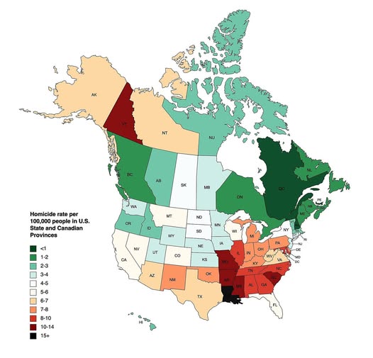
Showing homicide rates per 100,000 people across U.S. states and Canadian provinces, it paints a picture that is hard to ignore once you see it.
Canada Is Overwhelmingly Green
Scan northward, and the map turns a calming shade of green almost everywhere.
Most Canadian provinces sit below 2 homicides per 100,000 people, with Quebec, Ontario, and the Maritime provinces among the lowest on the entire continent.
The one striking exception is Yukon, the vast Arctic territory in the far northwest, which registers a notably high rate: a well-documented issue tied to geographic isolation, poverty, and limited access to social services.
The U.S. South Stands Out
Now look south, and the warmer colors cluster heavily in the southeastern United States.
Louisiana is the darkest point on the entire map, sitting in the 15+ category. Mississippi, Alabama, and parts of the surrounding region follow close behind.
This pattern aligns with decades of research linking higher homicide rates to poverty concentration, historical inequality, and gaps in public investment.
The West and Midwest: A Mixed Picture
The American West is more varied than you might expect.
Alaska trends high, while much of the Mountain West sits in moderate territory. The upper Midwest is notably calmer, with states like Minnesota and the Dakotas showing rates comparable to Canadian provinces.
New England, meanwhile, quietly mirrors its northern neighbours, with some of the lowest rates on the U.S. side of the border.
What Does This Actually Mean?
A few things worth keeping in mind when reading this map:
Rate vs. raw numbers matter. A sparsely populated state or province can have a high rate but very few total incidents.
Urban concentration plays a huge role. Many states with elevated averages have a handful of high-violence cities pulling the number up, while most of the state is far quieter.
This is a snapshot, not a verdict. Rates shift year to year based on policy changes, economic conditions, and reporting practices.
The Bigger Takeaway
What this map really illustrates is that geography, history, and policy choices compound over time. The contrast between the deep south of the U.S. and virtually anywhere in Canada is not accidental; it reflects generations of different approaches to healthcare, education, gun regulation, and social safety nets.
It is not about good people versus bad people. It is about the environments and systems people live within.
Worth thinking about next time someone tells you that where you live does not matter.
Help us out by sharing this map: