When Time Zones Become Art: The Beautiful Complexity of Global Time
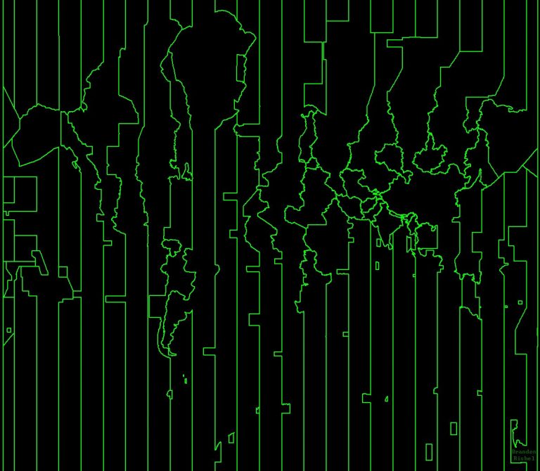
Map by Branden Rishel / Cartographers Without Borders Look at this striking green-on-black visualization of our planet, and you’re seeing …
Map by Branden Rishel / Cartographers Without Borders Look at this striking green-on-black visualization of our planet, and you’re seeing …
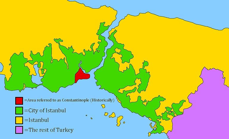
Map found on Reddit Ever wondered why Istanbul seems to have multiple identities? You’re not alone. This fascinating Turkish city …
Map by the Wisconsin Department of Natural Resources Looking at these two maps of Wisconsin tells one of America’s greatest …

Map by Reddit user Porodicnostablo Most Americans know the Great Lakes are big, but until you see them overlaid on …

Map by Reddit user TheJaice Imagine if someone told you that a single Indian state has more people than the …

Map by Reddit user Appropriate-Breath24 Ever wondered why the same flight from San Francisco to Dubai looks like a gentle …