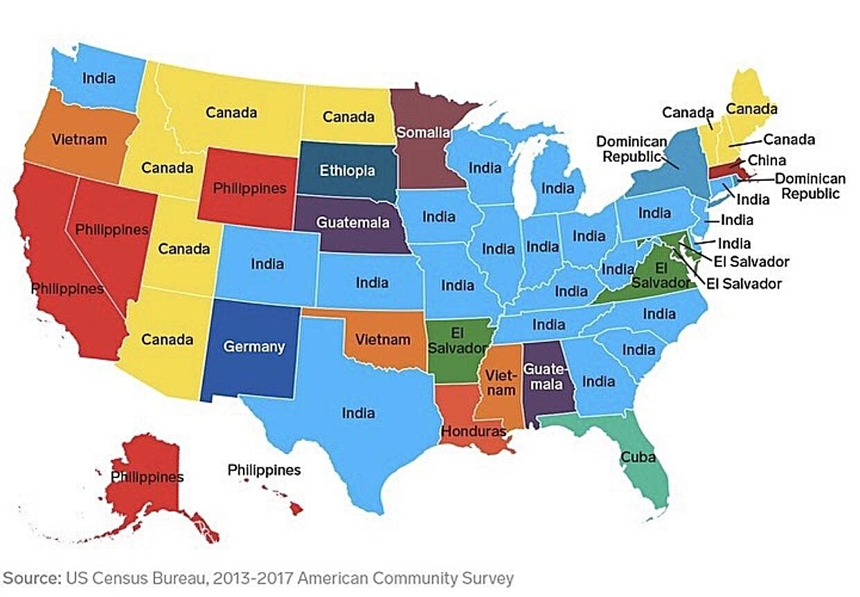
Map by Reddit user vladgrinch
Take a look at this fascinating map showing the most common birthplace of immigrants (excluding Mexico) in each U.S. state, and you’ll discover some surprising patterns that reveal the complex story of American immigration.
India’s Remarkable Reach
The most striking feature of this map is how India dominates the landscape.
From the tech corridors of Washington to the agricultural heartland of Kansas and the industrial centers of the Midwest, Indian immigrants have established significant communities across America.
This reflects both the H-1B visa program’s impact on skilled immigration and the growing ties between American businesses and Indian talent, particularly in technology, medicine, and engineering fields.
Regional Immigration Patterns Tell Stories
The map reveals distinct regional preferences that make perfect sense when you consider geography, economics, and existing communities.
Canada naturally claims states along the northern border, while Vietnam shows up prominently in states with historical refugee resettlement programs. The Philippines appears in states with significant military connections, reflecting decades of ties between American naval bases and Filipino communities.
Unexpected Connections
Some placements might surprise you. Somalia’s presence in Minnesota reflects one of the most successful refugee resettlement stories in recent American history.
Meanwhile, Ethiopia’s appearance in South Dakota highlights the diversity within African immigration patterns. These communities often start small but grow through chain migration, where established immigrants help family and friends follow similar paths.
The Economic Geography of Immigration
This map essentially shows us a snapshot of American economic opportunity through an immigrant lens. States with robust tech industries attract Indian professionals. Agricultural regions draw immigrants with farming backgrounds.
Areas with lower costs of living and established ethnic communities become magnets for new arrivals seeking economic advancement.
What This Map Doesn’t Show
Remember that Mexico would dominate this map if included, particularly in the southwestern states.
By excluding Mexican immigration, we get to see the secondary patterns that might otherwise be invisible. These “second-place” countries of origin often represent equally important immigration stories, just on a smaller scale.
The Continuing American Story
This data from the 2013-2017 American Community Survey captures immigration patterns that continue evolving today. Each colored state represents thousands of individual stories of people who left their homelands to build new lives in America, contributing their skills, cultures, and dreams to the ever-changing American mosaic.
Understanding these patterns helps us appreciate how immigration continues to shape America’s demographic and economic landscape in ways both obvious and subtle.
Help us out by sharing this map: