Map by Reddit user OK-General-1544
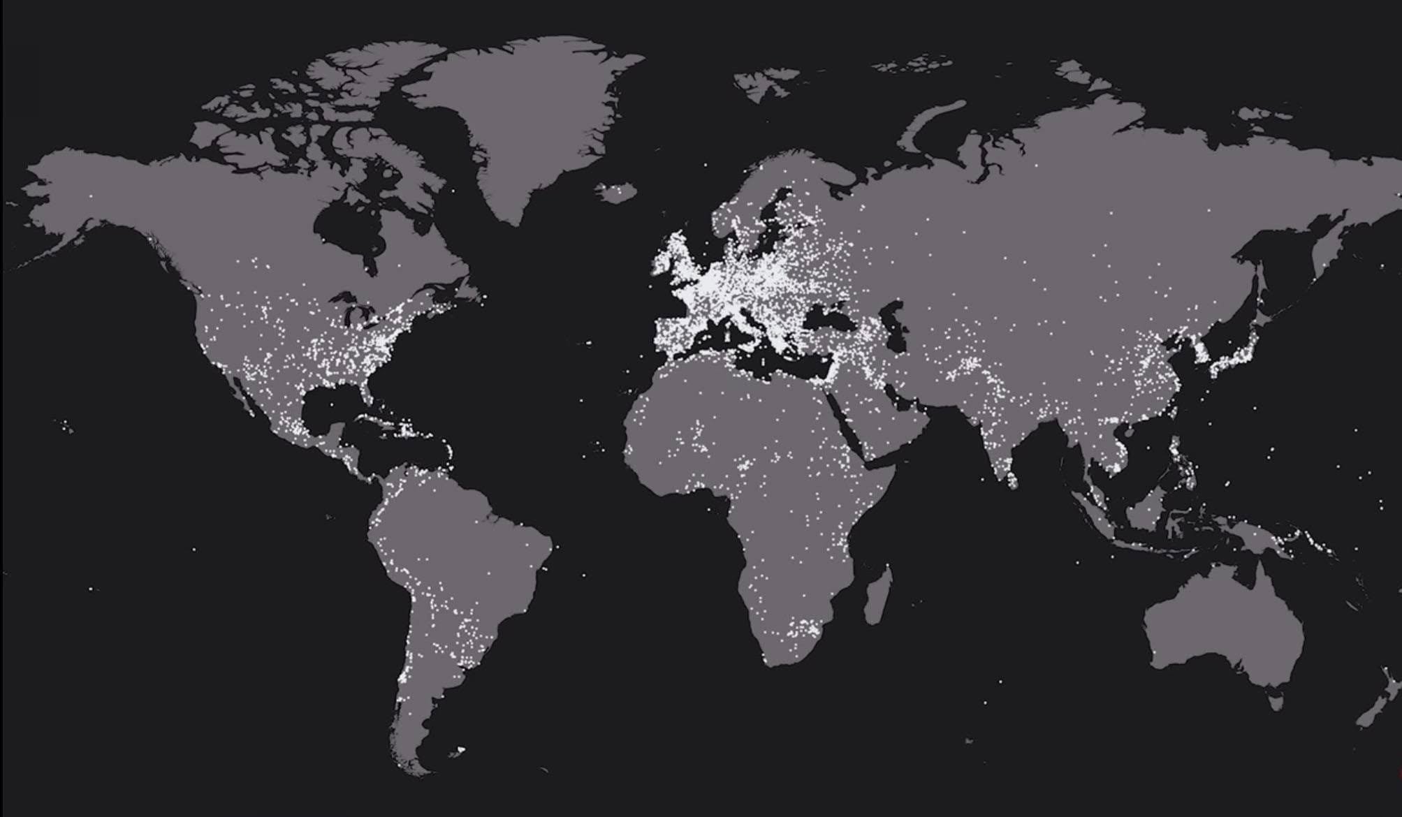
This striking visualization plots every documented battle from 2500 BC to the present, creating an illuminating portrait of human conflict across millennia. The white dots scattered across the continents tell a story that’s both sobering and fascinating.
What immediately jumps out is how unevenly distributed warfare has been across our planet. Europe practically glows with density, while vast stretches of other continents remain relatively dark.
Where the Fighting Happened
The concentration of battles in Europe is staggering. From the Roman conquests to the World Wars, the continent has been an almost continuous theater of conflict.
The Middle East and the Fertile Crescent also show intense clustering, which makes sense given this region’s role as the crossroads of civilizations for thousands of years. China and the Indian subcontinent display their own dense patterns, reflecting millennia of dynastic struggles and territorial disputes.
Meanwhile, the Americas show significantly fewer dots, largely because recorded history there doesn’t stretch back as far. Africa’s interior appears surprisingly sparse, though this likely reflects gaps in historical documentation rather than an absence of conflict.
Australia and the Pacific islands show the least activity, partly due to geography and partly due to the nature of conflicts in these regions.
What the Pattern Tells Us
The clustering isn’t random. Battles tend to occur along borders, trade routes, and in regions with dense populations and valuable resources.
Europe’s saturation makes sense when you consider its fragmented political landscape of competing kingdoms, empires, and nation-states. The continent’s relatively small size meant that territorial ambitions frequently collided.
The coastal concentrations around the Mediterranean, the North Sea, and the South China Sea highlight how much of human conflict has been about controlling maritime trade and naval supremacy.
Rivers too play their part, with battle concentrations following major waterways that served as natural boundaries and strategic assets.
A Sobering Reminder
Looking at this map, you’re viewing over 10,000 individual moments of human violence, each representing countless lives lost and communities shattered. Yet there’s also something instructive here. The patterns reveal how geography, resources, and political organization shape conflict. They show us that while human beings have indeed been fighting for thousands of years, that fighting hasn’t been random or inevitable everywhere.
The map also reminds us that recorded history itself has biases. We know more about European and Asian conflicts because those regions have extensive written records. Countless battles in other parts of the world simply weren’t documented in ways that made it to Wikipedia’s dataset.
Understanding where and why humans have fought might not prevent future conflicts, but it does help us recognize the patterns that lead to war. And perhaps that’s the first step toward choosing different paths.
Help us out by sharing this map: