Map found on Reddit
Australia is famously one of the most urbanized countries on Earth, yet it also contains some of the planet’s most breathtaking emptiness.
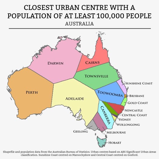
This fascinating map, with data taken from the Australian Bureau of Statistics, captures both truths at once, showing which urban centre of at least 100,000 people sits closest to any given point on the continent.
The result is a kind of gravitational map of Australian life.
The Big Surprise: Perth and Darwin Own the Outback
The most immediately striking thing is just how much territory Perth and Darwin claim between them.
Together, these two cities are the “nearest big centre” for well over half of Australia’s land mass, despite holding a relatively modest share of the total population.
Perth stretches across almost the entire western half of the continent, while Darwin commands a vast swathe of the tropical north. If you are standing in the middle of the Nullarbor Plain or the Kimberley, your closest city of meaningful size is still hundreds of kilometers away.
The Crowded Southeast Corner
Flip your eyes to the southeast, and the map transforms completely. Suddenly, the zones become tiny and tightly packed.
Sydney, Melbourne, Canberra, Wollongong, Newcastle, the Central Coast, Geelong, and the Gold Coast all carve out relatively small but densely populated territories.
This reflects the reality of where most Australians actually live. The southeastern corridor is home to the majority of the population, and urban centers compete intensely for geographic dominance over short distances.
Toowoomba: The Quiet Achiever
One of the more interesting zones belongs to Toowoomba, the inland Queensland city perched on the edge of the Great Dividing Range.
Its zone punches well above its profile, serving as the nearest large centre for a significant chunk of interior Queensland. It quietly anchors a region that many coastal Australians rarely think about.
Why Does This Map Matter?
Beyond being visually satisfying, this kind of map has real practical implications. Infrastructure planners, healthcare administrators, and logistics companies all need to understand urban gravity, knowing where people are likely to travel for services, work, and shopping.
It also puts into perspective just how extraordinary the Australian urban experiment really is. A country of over 26 million people, spread across a continent the size of the continental United States, essentially organizing its entire civic life around a handful of coastal capitals and a few inland anchors.
Next time someone tells you Australia is “basically empty,” show them this map. Technically correct, fascinatingly so.
Help us out by sharing this map: