Map by Griffith Taylor; archived by the National Archives of Australia
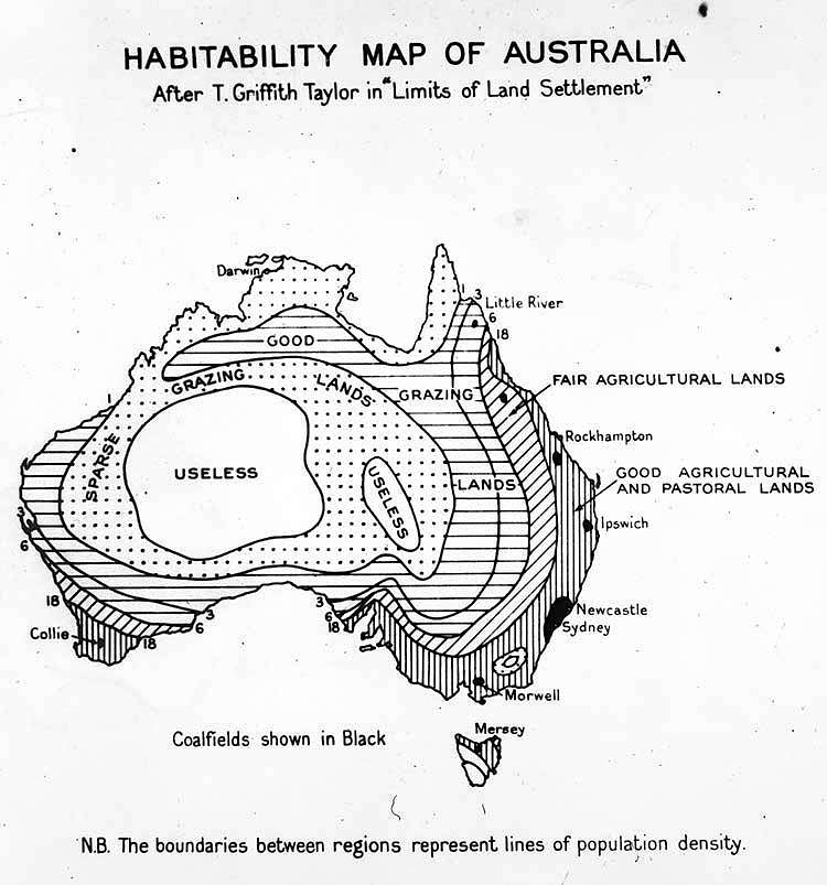
When Professor Griffith Taylor of the University of Sydney drew up his habitability map of Australia in 1946, he wasn’t pulling punches. He divided the continent into stark categories: good, fair, useless, and everything in between.
What emerges is a brutally honest assessment of where Australians could realistically settle after World War II.
The Harsh Truth About the Interior
The massive “useless” zone dominating the center of the map tells you everything you need to know about Australia’s red heart. This isn’t Victorian pessimism or outdated thinking. It’s geography.
The interior receives minimal rainfall, experiences extreme temperatures, and offers little in the way of reliable water sources. Taylor understood that despite romantic notions of taming the outback, some lands simply resist permanent settlement.
Where the Good Life Was Found
The eastern seaboard naturally claimed the “good agricultural and pastoral lands” designation.
Cities like Sydney, Newcastle, and Ipswich sat in these prime zones where rainfall was adequate and soils were workable. These weren’t just the population centers of 1946; they remain Australia’s most densely populated regions today. Taylor got this right.
Further inland, the “fair agricultural lands” around places like Rockhampton represented marginal country that could support farming with effort and the right conditions. These regions required more work but could sustain communities when managed properly.
The Grazing Lands
Perhaps the most interesting category is the vast “grazing lands” that arc across the north and sweep down through parts of the interior.
Taylor recognized that while these areas couldn’t support intensive agriculture, they could sustain pastoral activities. Cattle and sheep stations sprawled across these regions, working with the land’s limitations rather than against them.
The dotted patterns and horizontal lines weren’t just decorative choices. They represented real differences in carrying capacity and viability. Some grazing country was better than others, and the map’s patterns reflected these gradations.
A Map That Still Resonates
Looking at this map around 80 years later, what’s striking is how accurately it predicted settlement patterns. Population density still follows these boundaries remarkably closely. The cities Taylor marked remain the major urban centers. The useless interior is still largely empty.
Modern Australia has technologies Taylor couldn’t imagine: desalination plants, solar farms, and advanced irrigation systems. Yet the fundamental geography hasn’t changed. Water remains scarce in the interior. The coasts remain temperate and habitable. The outback remains challenging.
Taylor’s map reminds us that geography isn’t just any backdrop. It shapes where we live, how we build, and what’s possible. Understanding these limits isn’t defeatist. It’s practical wisdom that saved countless failed settlement schemes and wasted resources.
The next time someone proposes some grand scheme to populate the interior or transform the desert, pull out this 1946 map. Sometimes the old geographers knew exactly what they were talking about.
Help us out by sharing this map: