Map found on Reddit
At first glance, this world map looks like someone spilled a bag of Skittles across it. But look closer, and a fascinating story emerges. Each colored dot and highlighted nation tells us something profound about how a handful of European powers essentially redesigned the entire planet.
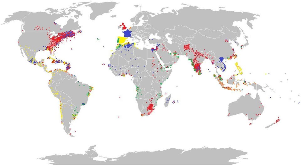
What Are We Actually Looking At?
The solid colored countries at the map’s heart give the game away. The UK sits highlighted in red, France in bold blue, and Spain or the Low Countries in yellow.
From those three little patches of Western Europe, colored dots radiate outward across virtually every continent, representing the lasting geographic, cultural, and political reach of their former empires.
Red dots blanket the eastern United States, South Asia, and parts of southern Africa. Blue dots pepper North Africa, West Africa, and Southeast Asia. Yellow markers trace the spine of Latin America.
It is a visual representation of colonialism’s extraordinary geographic reach, all from nations you could fit inside Texas several times over.
The Numbers Tell a Humbling Story
Britain alone, at its peak, governed roughly 25% of the world’s land surface. France controlled vast stretches of Africa and Indochina. Spain rewired the culture, religion, and language of an entire hemisphere.
The dots on this map are not just historical curiosities. They represent trade routes, legal systems, languages, religions, and borders that billions of people still live within today.
Why This Still Matters Today
Colonial borders drawn by European diplomats in the 1800s are still causing geopolitical friction right now.
The straight lines you see cutting across Africa on this map? Those were drawn at a conference table in Berlin in 1884, by people who had never set foot on the continent. Many of today’s regional conflicts trace directly back to those arbitrary boundaries.
Similarly, the reason English is the global language of business, science, and aviation is sitting right there on the map in red.
The Takeaway
This single image compresses centuries of history into one elegant visual. It reminds us that geography is never neutral, and that the modern world was not simply discovered but actively constructed by a small group of seafaring nations with extraordinary ambitions.
Next time someone asks why the world is the way it is, you can point to a map like this and say: it started right there.
Help us out by sharing this map: