Map by Reddit user Etchisketchistan
When we think about World War II, we often focus on military campaigns, political leaders, and dramatic turning points.
But this map reveals something far more personal: the devastating and wildly uneven human cost paid by different European nations. The stark gradient from pale pink to deep crimson tells a story that numbers alone cannot fully convey.
Eastern Europe’s Catastrophic Losses
The darkest regions on this map cluster in Eastern Europe, where the war’s brutality reached almost incomprehensible levels.
Poland lost approximately 17% of its entire population, while the Soviet Union suffered losses between 12% and 27% depending on the region.
Belarus, shown in the darkest shade, experienced losses exceeding 25%. These weren’t just soldiers; entire families, communities, and generations were erased through combat, genocide, famine, and systematic extermination.
The Western European Experience
The contrast with Western Europe is striking. Countries like Spain and Iceland, which remained largely neutral, lost only 0.02% and 0.17% respectively. Even nations directly involved in the conflict, like France at 1.44% and the United Kingdom at 0.94%, experienced dramatically lower casualty rates than their eastern counterparts.
This geographic disparity reflects not just military strategy but also the nature of occupation, resistance movements, and the horrific reality of the Holocaust concentrated in Eastern territories.
Why Such Dramatic Differences?
Several factors explain these variations. Eastern Europe became the primary battleground between Nazi Germany and the Soviet Union, with massive armies clashing repeatedly across the same territories.
The Nazi regime’s racial ideology targeted Slavic populations and Jewish communities concentrated in the East for systematic elimination. Siege warfare, scorched earth tactics, and deliberate starvation campaigns amplified civilian casualties.
Meanwhile, the Holocaust claimed six million Jewish lives, predominantly from Eastern European communities.
Western nations, while certainly suffering, often experienced shorter occupations or remained peripheral to the most intense fighting. Geographic factors mattered too; island nations like the UK could better control access to their territory.
Remembering the Human Scale
Behind every percentage point lie millions of individual tragedies. A 17% population loss in Poland meant approximately six million people, each with families, dreams, and futures stolen. These losses shaped demographic patterns, economic development, and cultural memory for generations.
This map reminds us that war’s burden falls unevenly, that geography and geopolitics can mean the difference between modest losses and near annihilation. It challenges us to remember not just the war’s outcome but its profoundly unequal human cost.
Help us out by sharing this map:
You May Also Like:
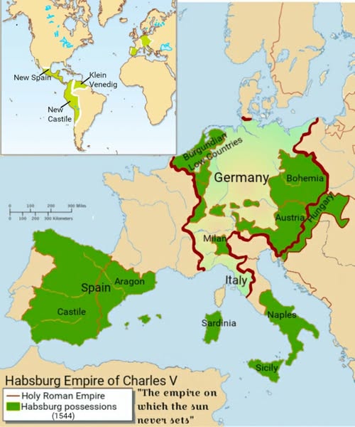
When One Man Ruled Half the World: The Habsburg Empire of Charles V
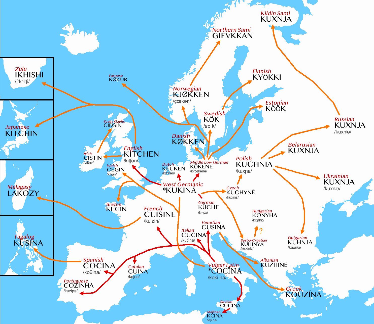
From Ancient Roman Kitchens to Modern Cuisines: How One Latin Word Spread Across Europe
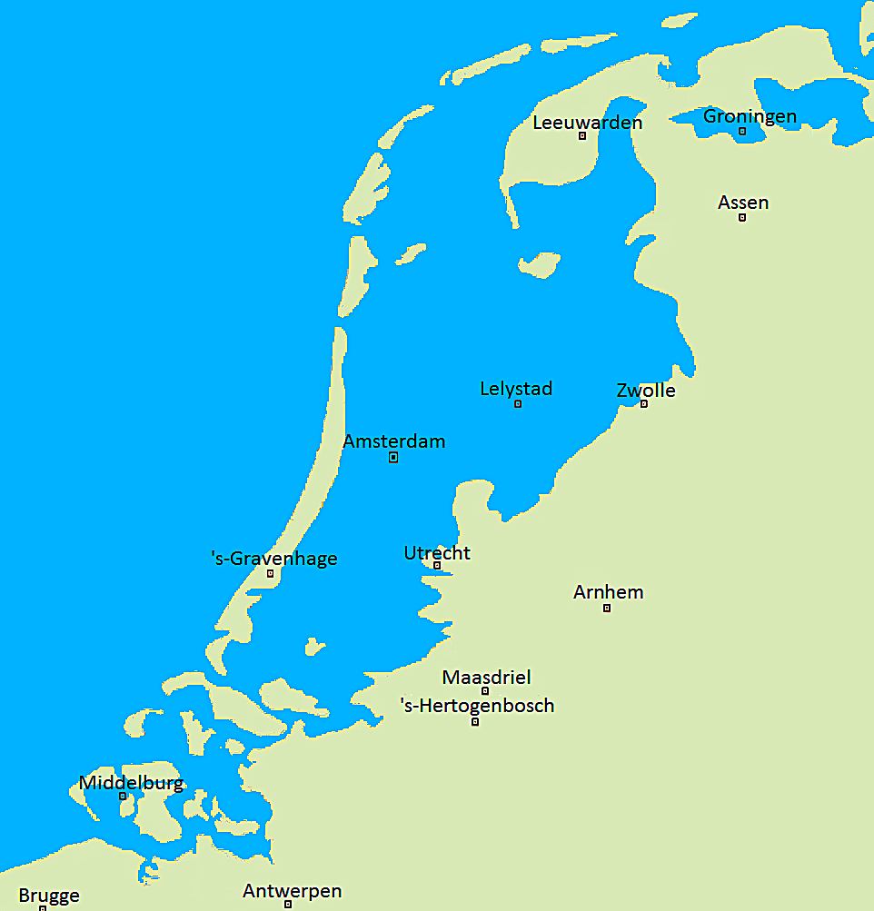
When the Sea Reclaims the Land: The Netherlands Without Its Famous Dikes
The Perfect Grid: Why La Plata, Argentina Looks Like a Giant Chessboard from Space
The Japanese Empire at Its Peak: Understanding the 1942 Pacific Dominance
When Did Your State Hit 1 Million People? A Census Journey Through American Growth
Why 60% of Iceland's Population Clusters in One Small Corner